Friday 22 October 2010

Colour in photos

The colour in your images can have a very big effect on how the image is perceived, it can be the simple emotions of feeling warm or cold, or it can be more complex. Not only can colour give the viewer an overall feeling for the image but the colours them self’s can compete within an image ether giving balance to an image or throwing the balance off making the viewer feel uncomfortable.


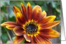
Some colours dominate more than others for the human mind but it depends on what their surrounding colours are. You can use colours that ether clash or complement each other for different effects within your image, if you look at a colour wheel the colours that are next to each other complement and the colours opposite will clash. Now this does not mean that you should not have them colours in the same image, just that you should be aware of what effect they will have on the mood of the image.


Where the colour appears in your image will effect the composition of the image and also the balance of different colours and how many. Sometimes a colour can compete with the main element of an image lessening the overall effect and sometimes the colours them self’s can be the main element of an image.


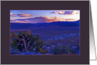
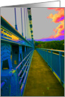
Changing the settings on your camera can make a place look totally different than what your eyes see, like using daylight setting indoors under tungsten lighting will give you a warm feel or a yellow / orange cast to the image. the thing is to play with colour till you get the image that you had in your minds eye in the camera, and do not forget to have fun.

Saturday 2 October 2010

Lead lines

Lead lines are elements in an image that draw the viewers eye into and around the image, the ones that come to mind first are the railway lines that seam to come together towards the horizon or a winding river or path that draws the viewer through the image. although these are lead lines that are seen in some of the more famous paintings and photos that are popular you do not need to use railway lines, paths or rivers but in fact can use almost any line to direct the viewer around your image, even unseen lines.


Many lead lines work on a subconscious level making them hard to compose in camera but with a bit of practice you will soon have the hang of it. The lines are used to guide the viewer into and around your image so you need to be careful that the lines in your image do not lead the viewer out of frame or too the edge of your image. Some lines will go from edge to edge in your image like the horizon but if you had railway lines going to the horizon this would give you a “T” of lead lines that would help to lead the viewer’s eye around the image. This would be more effective if the horizon was 1/3 from the top giving a tall “T” rather than 1/3 from the bottom giving a short “T”.


Having one major lead line in your image can give you a very strong composition but the use of multiple lines can also give you a strong composition without it being so obvious to your viewer, the trick is to make them work together and not compete with each other. Unseen lines as I like to call them is a persons line of sight, so if you have a person with a principal position in your image looking at something in or outside of the image then it will be human nature for people to follow the line of sight to see what they are looking at.


A lot of things can effect how well lead lines work not lest of which is the viewer, if they come from a culture where people read from left to right or from right to left will have an effect on how well the image may work for them. As with all rules for composition once you know them they are but tools for you to use or not to help you create your image and when you understand them feel free to break them.


Next time I will be looking at colour and how you can use it to bring feeling to your images.